Penn Improves on COVID Dashboard by Replacing Numbers With “This Is Fine” Meme
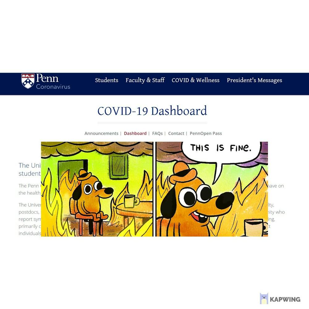
After calls for greater transparency, Penn has revamped its COVID-19 dashboard by replacing weekly numbers with the “This is fine” dog meme.
“We heard student concerns that our dashboard wasn’t cutting it so we went back to the drawing board and came up with something that’ll really give everyone some peace of mind,” administrator Ben Walsh said. The new dashboard is devoid of any statistics and is instead a single JPEG image of the lovable meme.
Walsh explained it was a matter of debate whether to provide detailed daily numbers on COVID cases, tests and prevalence in different student populations but ultimately, "This is fine" won out. “Let’s face it, students here already face an information overload and screen fatigue is a real thing so this seemed like a happy compromise,” he said.
Some students appreciated Penn’s efforts to communicate facts to them in a language they understand: memes. “This isn’t middle school, why should I have to look at numerators and denominators?” philosophy major Kevin Lee said. Design major Katherine Burke said the use of irony, with flames engulfing the dog in the meme, gave the dashboard a killer feature.
Rajesh Patel, the data consultant hired by Penn to implement the dashboard, took issue with criticism about whether Penn was getting value for money given the dashboard’s simplicity. He pointed out that if students were curious they could double click on the image which takes them to a page with the meme as an animated GIF so the flames move.
The administration has promised the new dashboard will remain functional even if the situation worsens: the burning Elmo meme is ready to be uploaded.